Currently open for work
Redesigning a property management platform
#project-Zonopoly
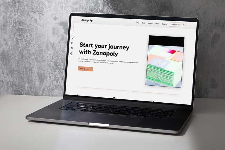

Zonopoly.io is a property and stock/crypto management platform. This startup was looking for a deep rebranding - new palette, fonts, website, the works. They needed to show their product was competitive, innovative, and professional. Additionally, they were inspired by Monopoly - the board game - and wanted to incorporate references into the new website.
Summary
My contribution
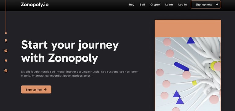
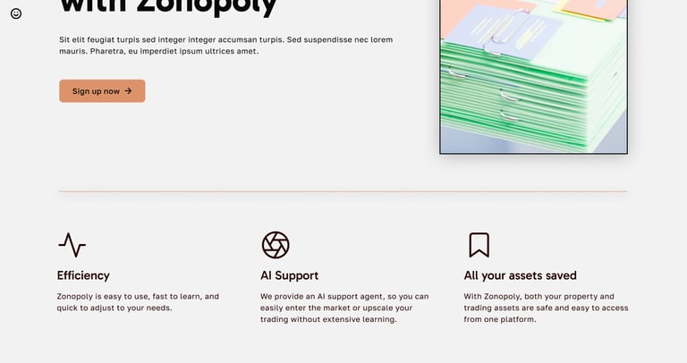
For this redesign, I wanted to blend the modernity of this project with its creative side - the Monopoly inspiration. I created a new design system that included nods and references to the famous Monopoly property cards and designed icons reminiscent of their style. I kept the colour scheme minimalistic, but included some classic Monopoly tones.
Additionally, I conducted competitor analysis, user research and testing, and review based on user feedback.
Services provided:
Figma design: wireframes, component kit, full working prototype
2 themes: light and dark, different iterations for animations
Competitor research, analysis, and comparison
User research and testing
Webflow development
Mission
Client
Zonopoly.io
My role
Creative UX/UI Designer
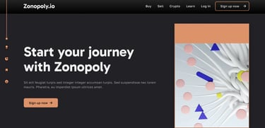

After discussing with the client, we came to the conclusion that we wanted to maintain a clean, polished look similar to platforms like Zillow and Binance, but wanted to integrate a bit more colour and creativity. Although the main inspiration came from a board game, I offered to include only a few elements that would 'nod' towards Monopoly. This helped maintain a more professional, minimalistic look and would ensure the users would see Zonopoly as a strong, modern brand.
As the result of competitor research, I compiled a document outlining each company's design decisions, their reasoning, and why it worked for them. Moving forward, I frequently referenced this document to understand which features and solutions worked for them - and which ones would work for Zonopoly.
Process & Strategy
Wireframe Development
Research & Structure
Having completed research, I moved to webflow development and wireframing. To keep focus specifically on the redesign, the client and I decided to limit the wireframes to the landing page, which would give us an overview of the future look and make it easier to create more iterations to choose from.
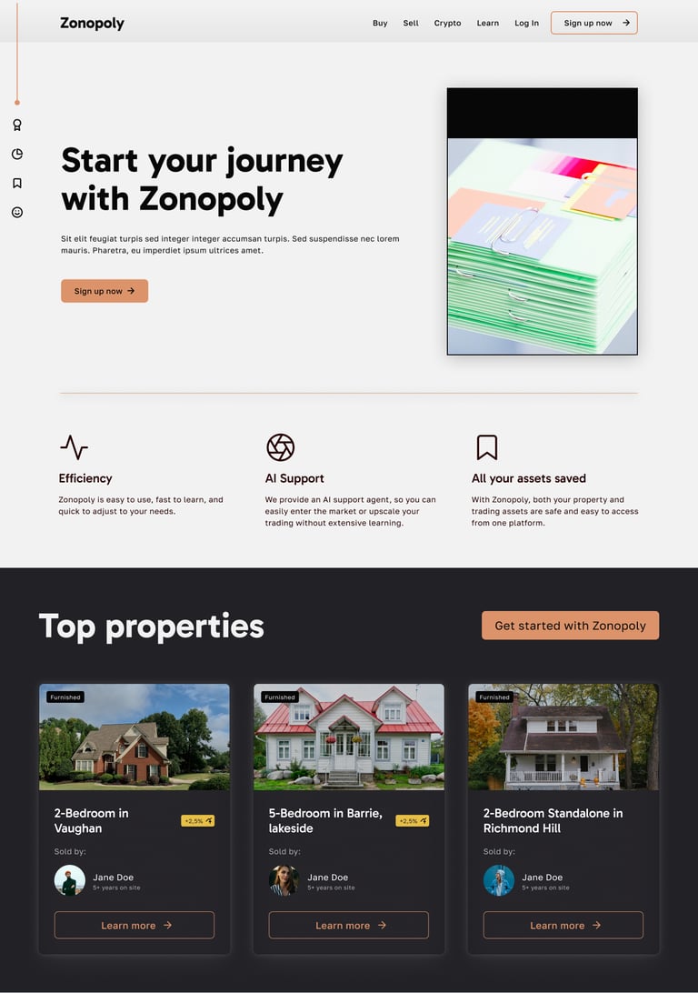
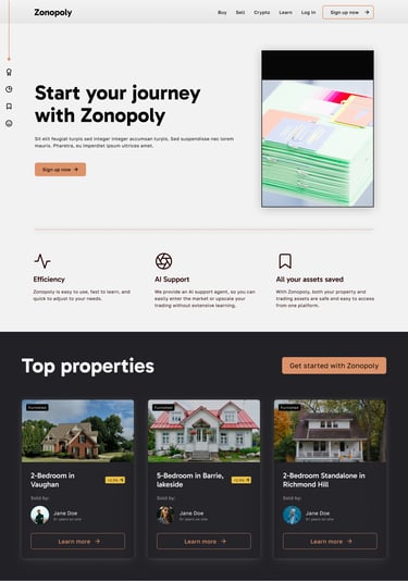
I created low- and high-fidelity wireframes and played with different layouts to make navigation easier and intuitive. With wireframes approved, I created a full working prototype - ready for testing.
User Testing & Final Adjustments
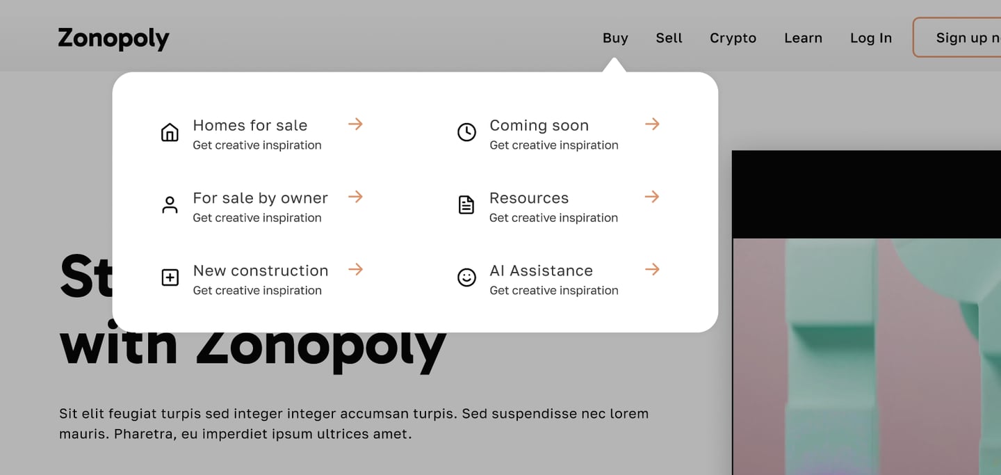
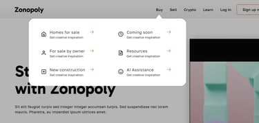
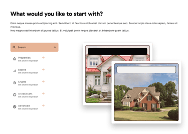
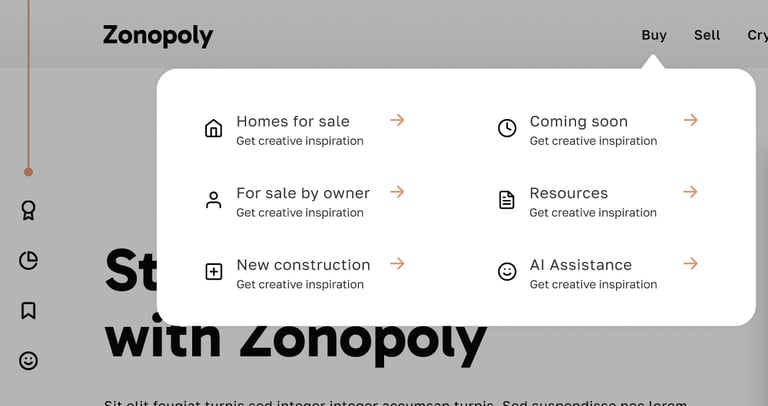
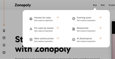
User testing was a highly useful step for this project - it allowed collecting feedback and understand how well the redesign reflected users' needs. During testing, I uncovered 2 essential points: (1) users wanted to read more about Zonopoly's features, (2) users wanted a fast way to navigate right from the get-go.
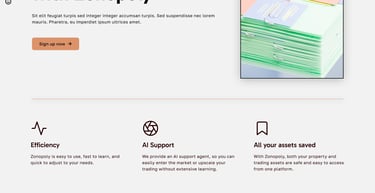
To accommodate this, I added a block right below the hero, outlining Zonopoly's 3 strongest features, and included more options in the header navigation system. This allowed the users to learn more about what Zonopoly could offer them right away and find features they were looking for without scrolling down or moving through multiple menus.
I'm open to opportunities
Let's talk! Reach out to me - I'm always happy to talk projects, startups, and more.
If you prefer, you can contact me on other platforms or by email:
Liubov Stepanishcheva © 2026